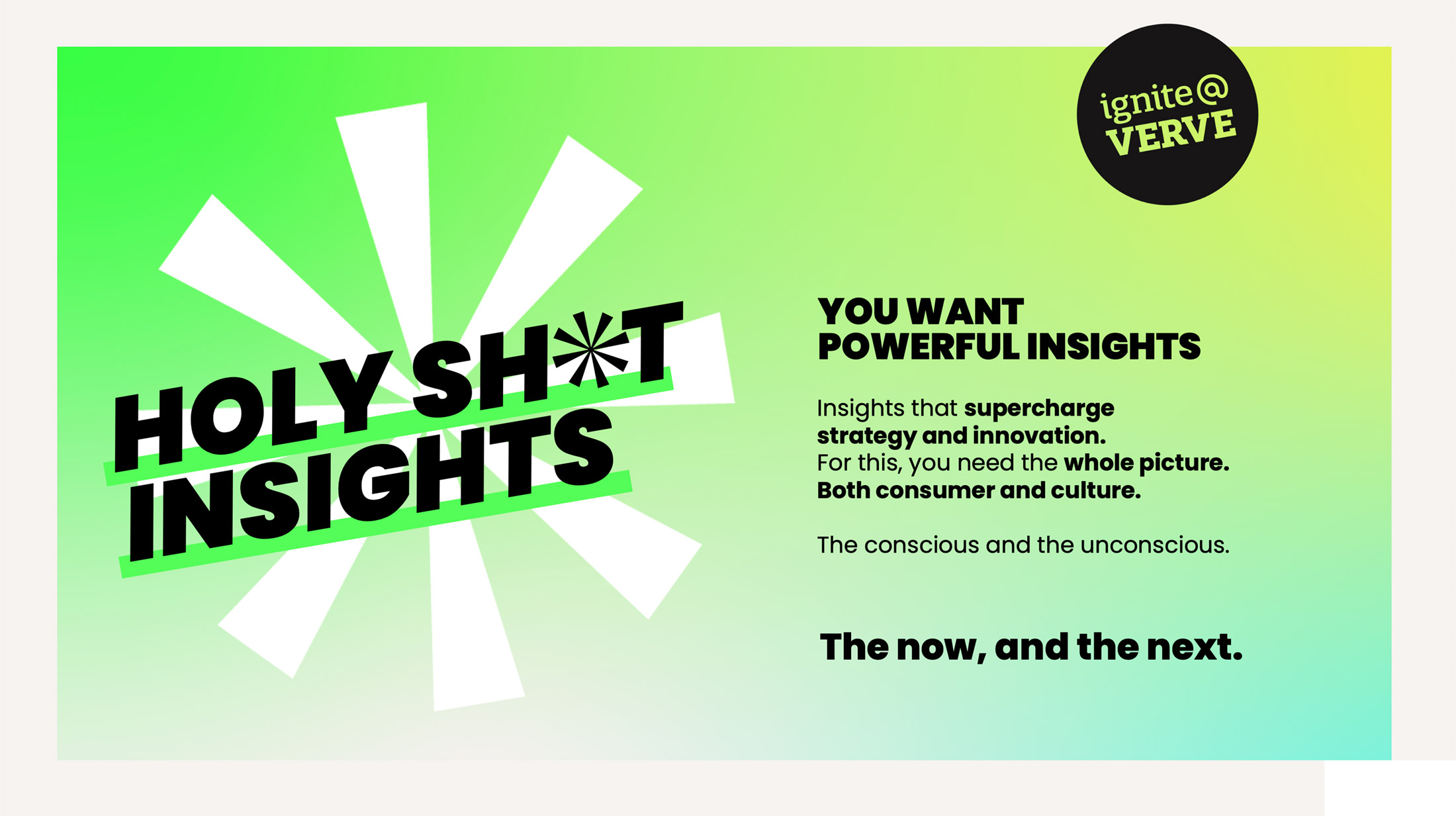
Drive was commissioned to evolve the Ignite@VERVE sub-brand after completing a successful brand refresh for VERVE – the global insights and consumer research consultancy.
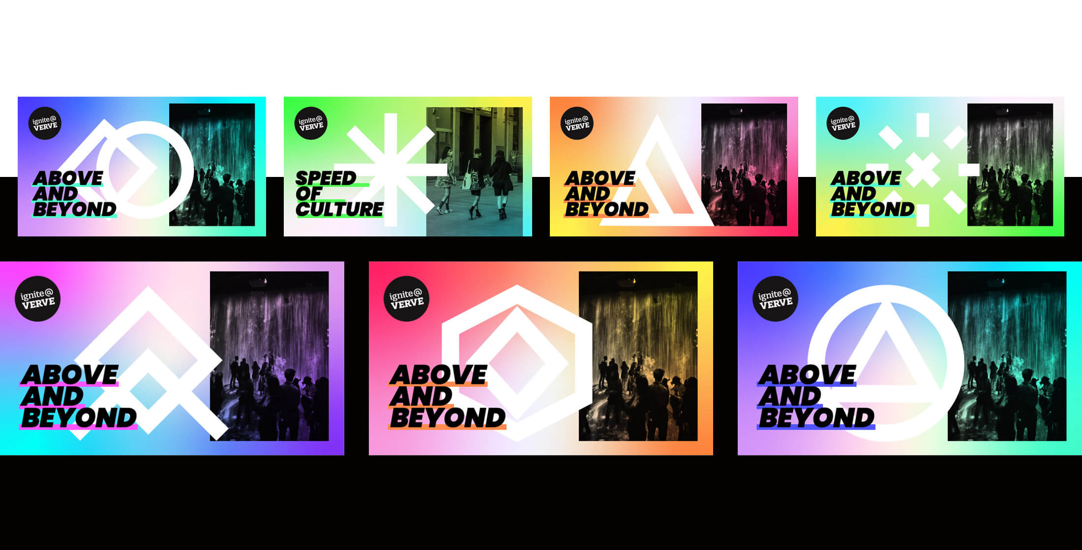
The existing logo and brand font were retained, as it was important to communicate the offering as an extension of the main VERVE brand. A logo roundel and corner logo devices were created to allow flexibility of positioning on different applications and convey an urban fly-posting aesthetic. A vibrant acid gradient colour palette was developed, stemming from the main VERVE palette to retain synergy with the main brand, but pushing the rebellious edge of the Ignite sub-brand’s personality.
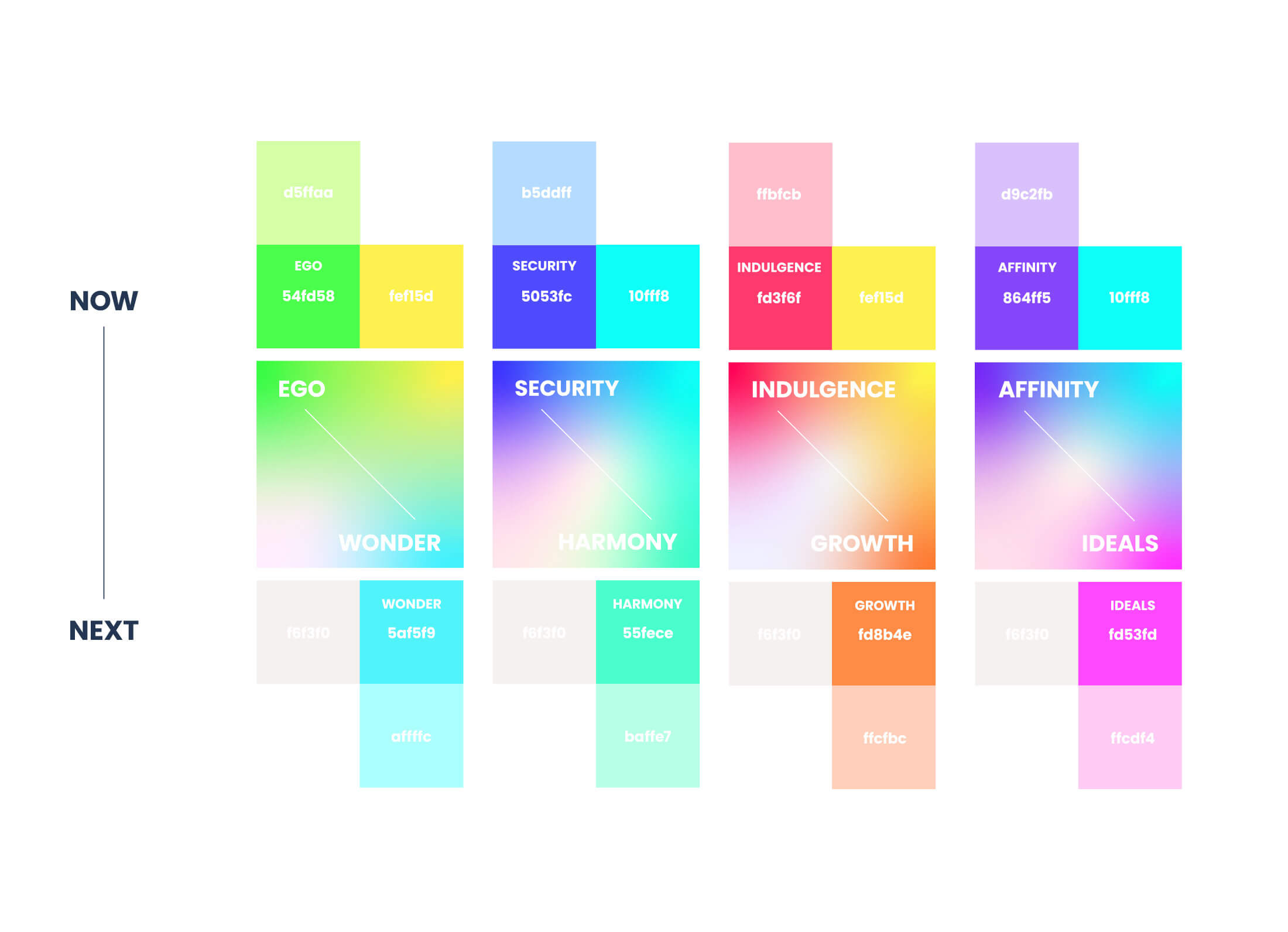
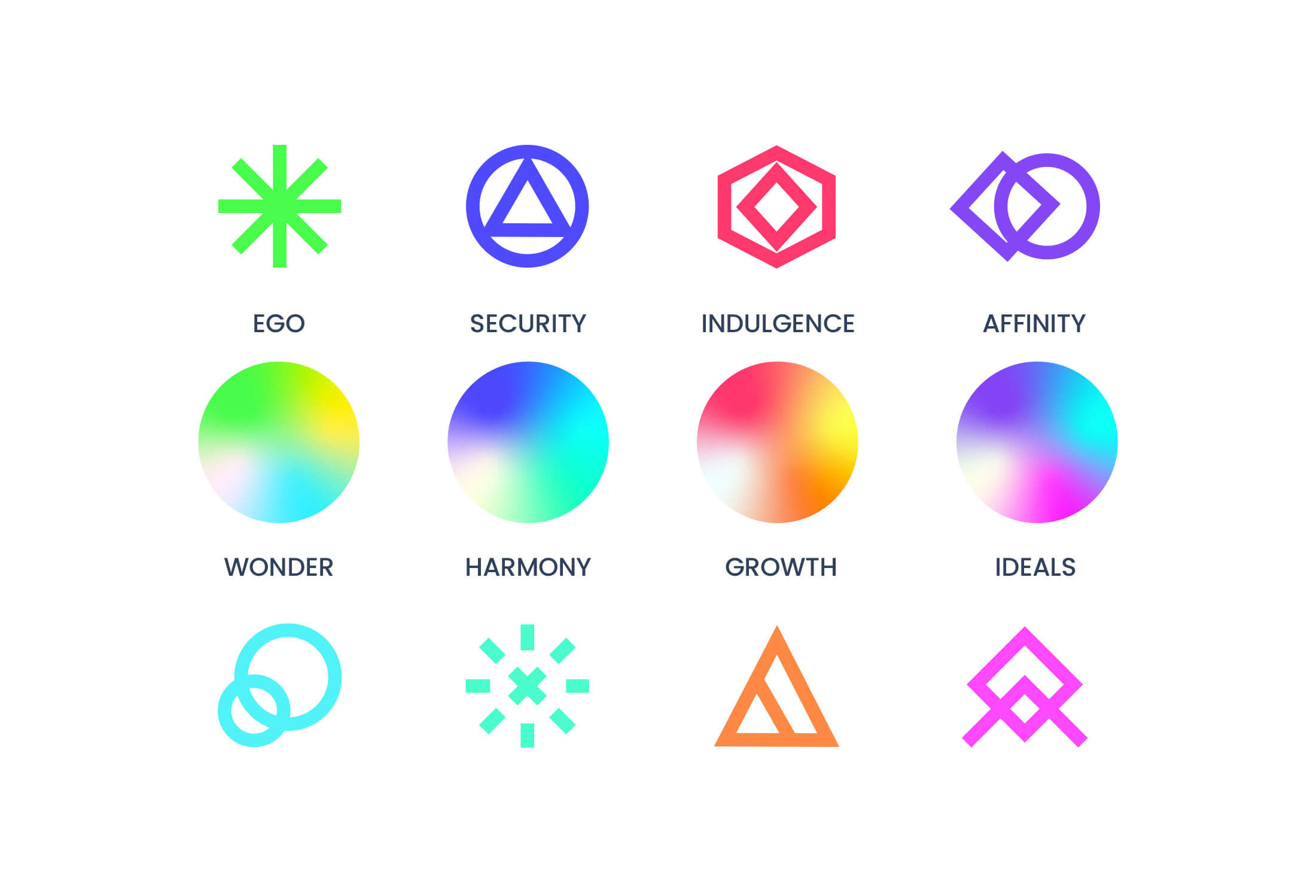
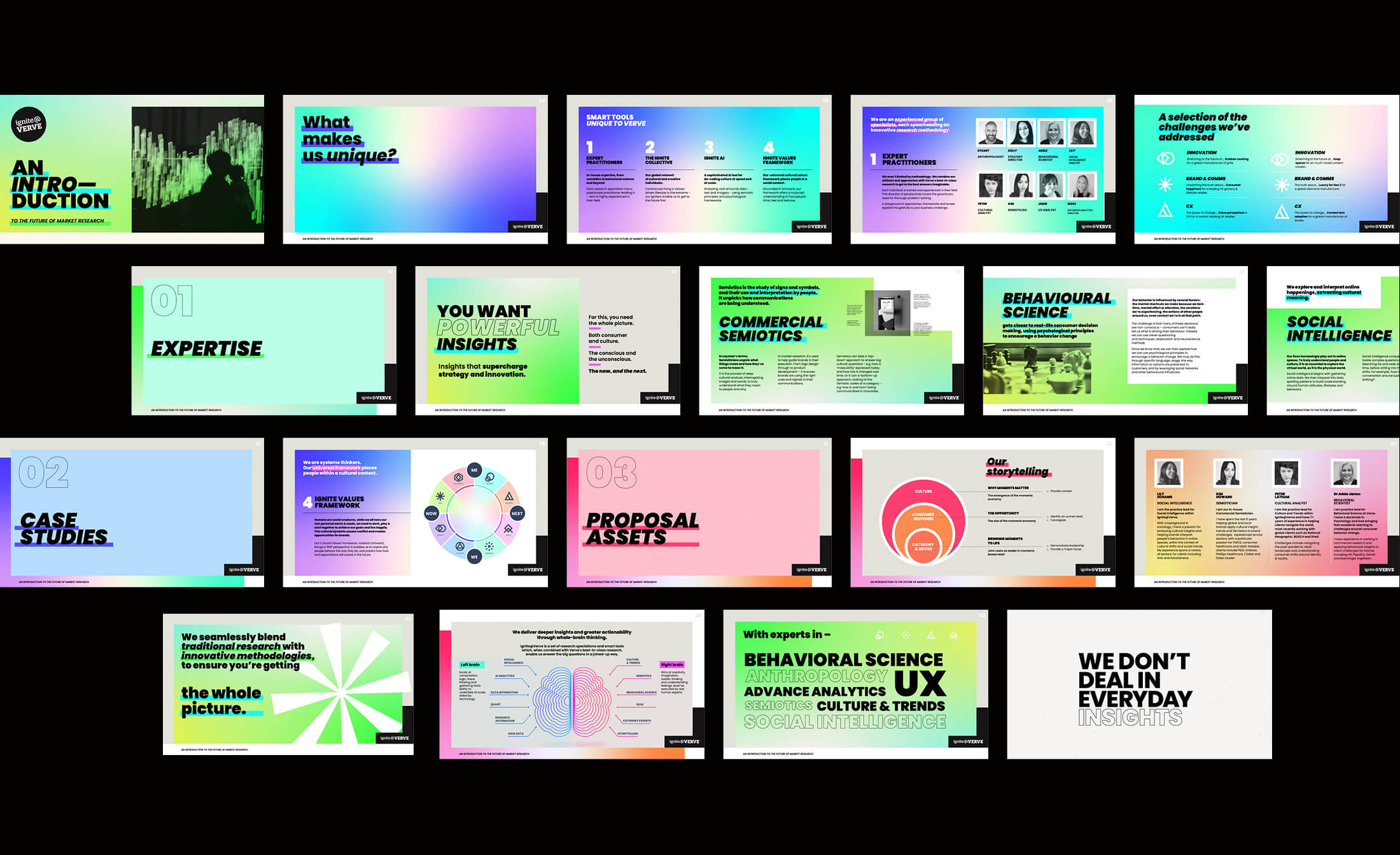
The Universal Values model is central to Ignite’s way of working and is used in presentations to organise audience insights. It comprises 4 pairs (eg NOW / NEXT), from which we created a series of 8 graphic icons, along with specific colour pairings to represent each of the 8 values for use. At the same time, 4 bespoke gradients were created to reflect the pairings and aid storytelling and navigation.
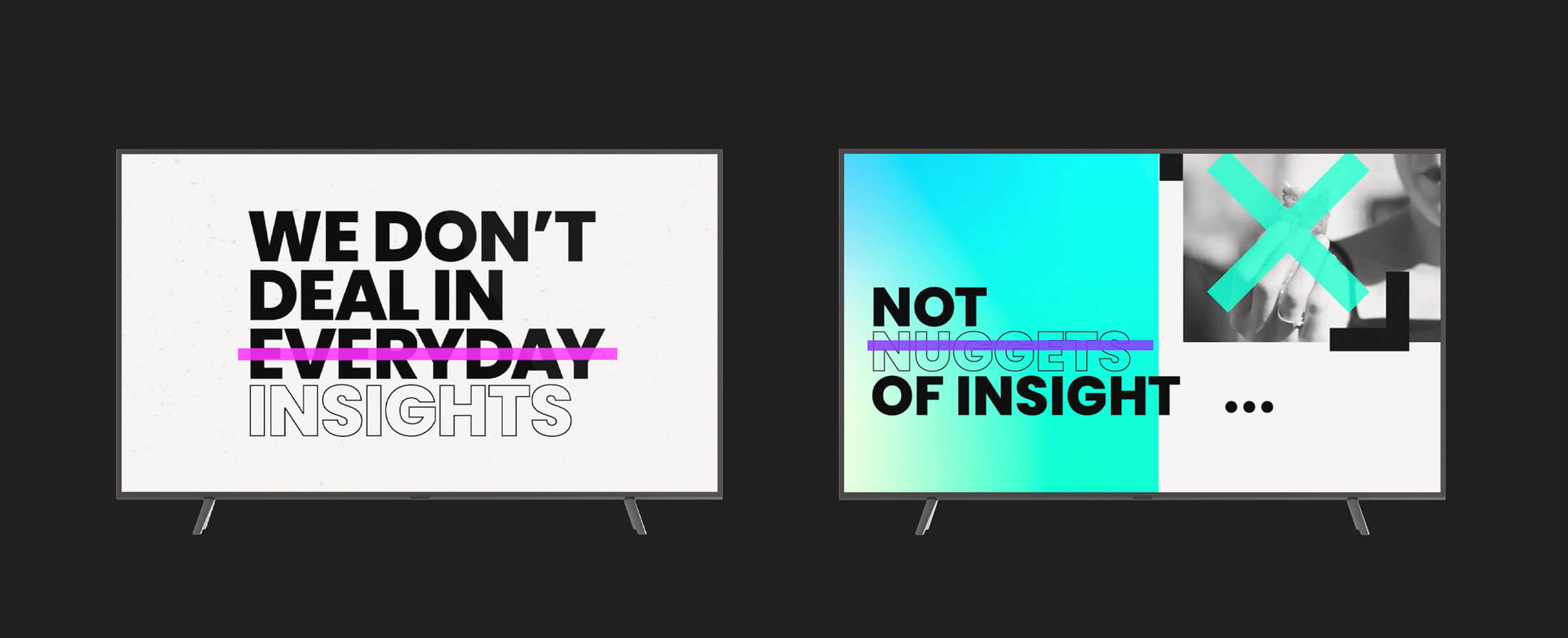
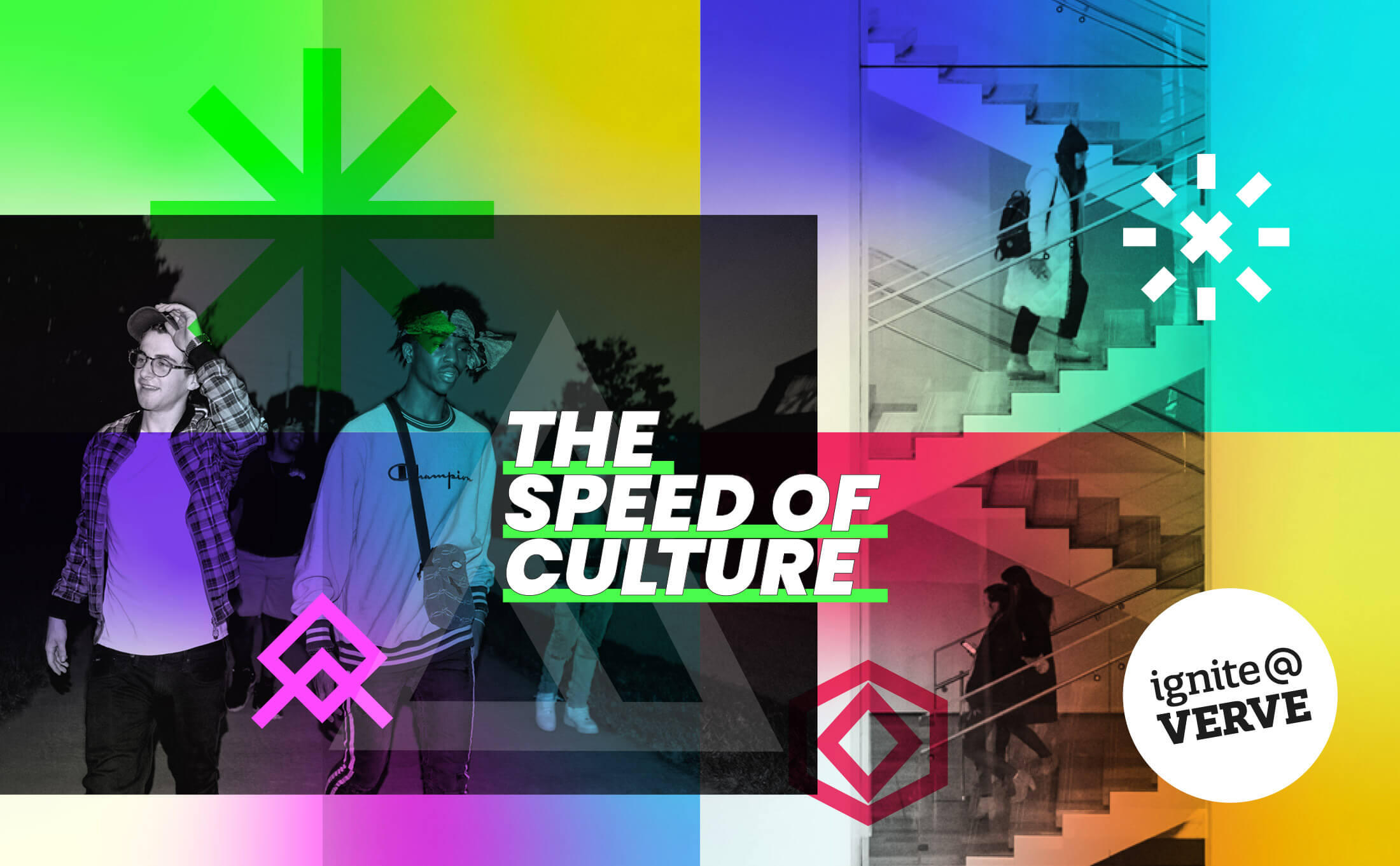
Ignite’s core concepts – spark / fuel / fire – have been evolved and represented through an abstract, urban graphic style. Bright colour, bold typography and confident messaging contrasts with a series of black and white imagery that echoes screen-printed posters used in guerrilla marketing. Other deliverables included an impactful credits deck, and templates for reporting slides as well as typographic motiongraphic videos.